
We were recently interviewed by Gareth Halfacree of Custom PC Magazine for our pixel art and animation software, Swanky Paint.
The photo I took of ourselves included an elaborate balancing act of the camera precariously placed on the edge of a stack of board games, clicking the timer button and rushing into position by jumping on the bed without knocking everything and everyone, placing the laptop in the appropriate place and smiling nonchalantly whilst gazing into the neon screen. Of course, this took quite a few tries including just the one with the cat. Unsurprisingly, that was the photo we chose :}
Anyways, have a read if you have time. It covers quite a few things we hoped to mention but haven't had time to, including plans for the future of Swanky Art Packages (hint: it's not just pixels).
The Hobby Tech column includes a @wetgenes interview about the excellent Swanky Paint and an @Intel Edison review. https://t.co/bAOoDqWoid
— Gareth Halfacree (@ghalfacree) April 20, 2015The photo I took of ourselves included an elaborate balancing act of the camera precariously placed on the edge of a stack of board games, clicking the timer button and rushing into position by jumping on the bed without knocking everything and everyone, placing the laptop in the appropriate place and smiling nonchalantly whilst gazing into the neon screen. Of course, this took quite a few tries including just the one with the cat. Unsurprisingly, that was the photo we chose :}
Anyways, have a read if you have time. It covers quite a few things we hoped to mention but haven't had time to, including plans for the future of Swanky Art Packages (hint: it's not just pixels).
One of the things I'm actively looking out for are ways to map the data we've been collecting from Leeds Art Crawl, be they on a map or any other methods of visualisation. I used Google Maps on the site as it seemed like the fastest (and simplest) way back then to theme and plot. I've previously looked at OpenStreetMap, Stamen, D3, TileMill, CartoDB, Leaflet.js and a few others whose name escapes me at the moment but they all seemed to involved sometimes complicated setting up and/or hosting it ourselves under circumstances that took much wrangling. They also all seem to be permutations of OSM in some and many ways. Google maps, even though limited in some ways, hosted it for us and allowed some semblance of customising; this was good enough for me.
6 months later and I've got some free time at 4am so I'm wandering back to these sources to see if I've missed anything. Lo and behold!
Why haven't I spotted, well, Dotspotting before?!
I'm loving the export functions. The thing is, I'm creating zines from Leeds Art Crawl as a sort of archival and tour map of public / found art in the city. One of the things that is also created from this project is a map complete with LAT/LNG coordinates (the Google Map I was yapping about earlier) which spits out a JSON feed that updates itself when new locations of art gets added to the site.
Currently, creating the art map for the zine has been done manually; screenshots, illustration, cropping images etc, and this is obviously not ideal so Dotspotting's export function is very attractive to me. I'm having to create the next issue soon so will have to see if this relationship works out.
Anyway, as you can see, the map above by Dotspotting is lovely. Here's the same map using our own embedding code below.
Two completely different-looking maps using the same data. Quick run through of pros and cons for both - Dotspotting map looks cluttered but to be fair, I chose to display the images like that. I made the thumbnails smaller but the clutter remained as obstructions on road names except now you can't see the art. Google Maps allowed me to have an interstitial between a visual clue and a popup that displayed the art of that location, at a decent legible size, when you click on it.
By the way, when you get stuck having clicked on an art in Dotspotting, right-click and choose, "Back" to go back to the map view.
Dotspotting has a myriad of wonderful styles to choose from and the flexible import function of many formats is great though they don't accept JSON feeds. I've had to manually convert our JSON feed into CSV for it to accept the data. Even then, I've had to delete all data that had no location attached to them ("0" in the LAT/LNG field) since the uploader wouldn't accept the data as it was without me manually deleting the offensive data, one at a time (no batch delete where I've looked) on the site, after uploading it. Google Maps have a limited theme choice unless you sit down and create your own, which can take some time reading through the documentation for options. In fact, if I recall, some of the options were deprecated and should probably not be used.
Finally, both maps are contained within iFrames. This renders problem when links are clicked as entire sites will load in them! I should probably disable this or open the links away from the iFrame for our embedded map. Hopefully, the Time Faerie will visit sometime soon so I can fix this issue :}
Oh, one last thing, maybe. For large images of maps in a myriad of themes, Stamen has made a lovely tool for doing just the thing. Examples below. Not sure why the watercolour one is a little iffy.


If you want good, clean and printable maps, try Field Papers, designed for printing and writing on in real life.
Or if you're really serious about customisation, try Map Stack for the easiest tweaking experience I've ever had for maps on the web. All courtesy of Stamen.
6 months later and I've got some free time at 4am so I'm wandering back to these sources to see if I've missed anything. Lo and behold!
LeedsArtCrawl_071014 on Dotspotting
Why haven't I spotted, well, Dotspotting before?!
I'm loving the export functions. The thing is, I'm creating zines from Leeds Art Crawl as a sort of archival and tour map of public / found art in the city. One of the things that is also created from this project is a map complete with LAT/LNG coordinates (the Google Map I was yapping about earlier) which spits out a JSON feed that updates itself when new locations of art gets added to the site.
Currently, creating the art map for the zine has been done manually; screenshots, illustration, cropping images etc, and this is obviously not ideal so Dotspotting's export function is very attractive to me. I'm having to create the next issue soon so will have to see if this relationship works out.
Anyway, as you can see, the map above by Dotspotting is lovely. Here's the same map using our own embedding code below.
Two completely different-looking maps using the same data. Quick run through of pros and cons for both - Dotspotting map looks cluttered but to be fair, I chose to display the images like that. I made the thumbnails smaller but the clutter remained as obstructions on road names except now you can't see the art. Google Maps allowed me to have an interstitial between a visual clue and a popup that displayed the art of that location, at a decent legible size, when you click on it.
By the way, when you get stuck having clicked on an art in Dotspotting, right-click and choose, "Back" to go back to the map view.
Dotspotting has a myriad of wonderful styles to choose from and the flexible import function of many formats is great though they don't accept JSON feeds. I've had to manually convert our JSON feed into CSV for it to accept the data. Even then, I've had to delete all data that had no location attached to them ("0" in the LAT/LNG field) since the uploader wouldn't accept the data as it was without me manually deleting the offensive data, one at a time (no batch delete where I've looked) on the site, after uploading it. Google Maps have a limited theme choice unless you sit down and create your own, which can take some time reading through the documentation for options. In fact, if I recall, some of the options were deprecated and should probably not be used.
Finally, both maps are contained within iFrames. This renders problem when links are clicked as entire sites will load in them! I should probably disable this or open the links away from the iFrame for our embedded map. Hopefully, the Time Faerie will visit sometime soon so I can fix this issue :}
Oh, one last thing, maybe. For large images of maps in a myriad of themes, Stamen has made a lovely tool for doing just the thing. Examples below. Not sure why the watercolour one is a little iffy.
If you want good, clean and printable maps, try Field Papers, designed for printing and writing on in real life.
Or if you're really serious about customisation, try Map Stack for the easiest tweaking experience I've ever had for maps on the web. All courtesy of Stamen.
We've got a new release!
Watch the video above for more details and if you are lucky, there may even be a few dimeloads available at http://dime.lo4d.net/dl/swpaint/plus6delascan.
So grab one and get your swank on :}

If you've been following our developments, there might be more changes in this latest release than what is listed below as there has been quite a gap since our last update earlier this year!
New release includes:
- Attribute clash mode for Commodore 64 and Spectrum
- Scanlines
- Menus as shortcuts
- Animation frames and animated gif support
- Added Swanky16 and Swanky32 palette
- Hack mode (secret)
- Quick Save button
If you've managed a copy to play with and found any bugs, send us your reports. We appreciate it!
Swanky Paint is on Greenlight! Do vote if you like what we're doing :}
Also, if you're running the Chrome browser, you can try out Swanky Paint and play along with us at our new pixel art community, Swanky Art.
Watch the video above for more details and if you are lucky, there may even be a few dimeloads available at http://dime.lo4d.net/dl/swpaint/plus6delascan.
So grab one and get your swank on :}
If you've been following our developments, there might be more changes in this latest release than what is listed below as there has been quite a gap since our last update earlier this year!
New release includes:
- Attribute clash mode for Commodore 64 and Spectrum
- Scanlines
- Menus as shortcuts
- Animation frames and animated gif support
- Added Swanky16 and Swanky32 palette
- Hack mode (secret)
- Quick Save button
If you've managed a copy to play with and found any bugs, send us your reports. We appreciate it!
Swanky Paint is on Greenlight! Do vote if you like what we're doing :}
Also, if you're running the Chrome browser, you can try out Swanky Paint and play along with us at our new pixel art community, Swanky Art.
Do you know the Million dollar page?
Oh good, cause that's pretty much it.
Except it uses Place Kitty and Braintree API & it's for a good cause :}
( there's also a really obvious easter egg in there that you can access with a few masterly strokes of the keyboard )
Oh yeah and there's also this *little* hack to be displayed on the LED Cube.
@iMartyn's beautifully soldered baby coded w/Python and ran with 4 @arduino's running 3 chips a piece #leedsHack pic.twitter.com/spnpxSPWyv
— Alison B Lowndes (@AlisonBLowndes) August 2, 2014Current team members:
 Kriss Blank @wetgenes
 Martyn Ranyard @iMartyn
 Paul Brook @pbrook80
 shi Blank @shi
More/less info about the team lives on the official page - http://live.hackinabox.org/teams/twobytwo
Github pages:
1. MillionKittyAPI
2. LED cube demo application
The hack is finished!
1. Swanky Cube
2. The Million Kitty Page
A tribute to the Million Dollar Page, this hack uses the Place Kitty and Paypal/Braintree API to create a website filled with various sizes of greyed out Kitty images that you can purchase with Paypal to link to your website.
You are also allowed a paragraph of text. Any images purchased will become the colour version of varying saturation, depending on the price. Any image link can be outbidded by anyone. Money raised will also be donated for a good cause to rehome real kitties.
*There is an easter egg if you type in the right code!*
Visit the live site - Rehome a kitty!
This was our first ever physically located, official game jam. As in, a game jam that took place in an actual location with other people also making games with the same theme as the challenge. Previously, we've participated in hackathons where we always had games as the final output and there were some digital game jams that we organized ourselves, more as a spectacle to produce examples for our own game engine done in an allocated time period for our own games community or anyone else to watch live and comment in real time. Just because we can but also because we needed to populate the engine with examples that people can then play around with and mod for their own amusement. And what better way to do that than with a game jam? These jams lasted for a minimum of 2 hours to a maximum of 4 hours but this proved to be too exhausting (and a bit mental) so we've sorta stopped doing them.
And there we were, getting lost in Leeds waiting for a bus that never came and finally arriving at Leeds Metropolitan University, 3 minutes before the event officially started. We had no idea what to expect or who would be there or what we were expected to do.
After going through what seemed like endless doorways of twisty little passages, all alike, we found the room that held about 20 or so students. Feeling a little out of place, we were greeted enthusiastically by the organizers which alleviated the discomfort, somewhat. A blur of announcements about the theme, initiation of ground rules and safety precautions if a fire were to happen, a flurry of photographs following instructions of various poses by the students and a free tshirt later, we were to begin jamming.
So, what to do, what to do? The theme was, "Cycles" and we have a day to make a game (presentation tomorrow!). As the event was held in the spirit of the Tour de France, we decided to make a cycling game. Or rather, a multiplayer strategy flocking game where you race to get the highest score whilst pushing your opponents to get the bad bits with the main game displayed on a big screen, all controlled by a simple webpage on players phones.
And "Depart due" was born - a cheeky play on Gérard Depardieu with the theme and all, also the characters in the game all have tribute anatomy on their faces. It's something we've been meaning to make - a digital arcade type thing - where as many people you can crown into a location can all play on a single screen. We're looking into installing these in pubs, public spaces, private spaces - anywhere with a screen.
We've got it working across all platforms (laptops/smartphones/tablets any OS) since the controller is just a javascript widget that runs in a browser. All the action takes place on the main screen which acts as the webserver so this shit is portable, yo. It's got funky physics, original theme tune and sound effects along with the graphics which should be explained in this video which we made whilst delirious due to lack of sleep so pardon everything!
We're hoping to get this working on the Pi and maybe a Pico projector attached to it so we can put it in the wild somewhere (project on to wall, people walk by, play with random strangers). If you're interested, the source code is available here - https://bitbucket.org/xixs/gamecakejam/src/tip/depart/
And as with all our games, it's all open source. That includes the images, sound effects and music. Here's a taster of the images and music I made during the game jam.
We've placed a couple of our most beloved projects on Greenlight recently. Thanks to the proceeds from Bundle Bandits, we managed just about enough to cover the costs of participating in Steam's indieventure so we will definitely put in as much as we can give.
I'm going to place the links here if you're feeling generous to vote our way. Many thanks in advance :}
In keeping with timing of releases and all that, we also made public Swanky Art, our new pixel art community based on restrictive daily challenges where you can play with the online version of Swanky Paint. We've got fun plans for this project as it is dear to our hearts and hopefully other people feel the same way about it.
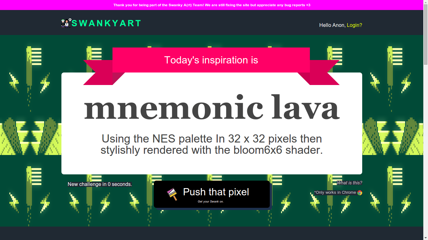
You can start pushing pixels, view your galleries and comment on other peoples', along with various other things on the official site - http://paint.lo4d.net.
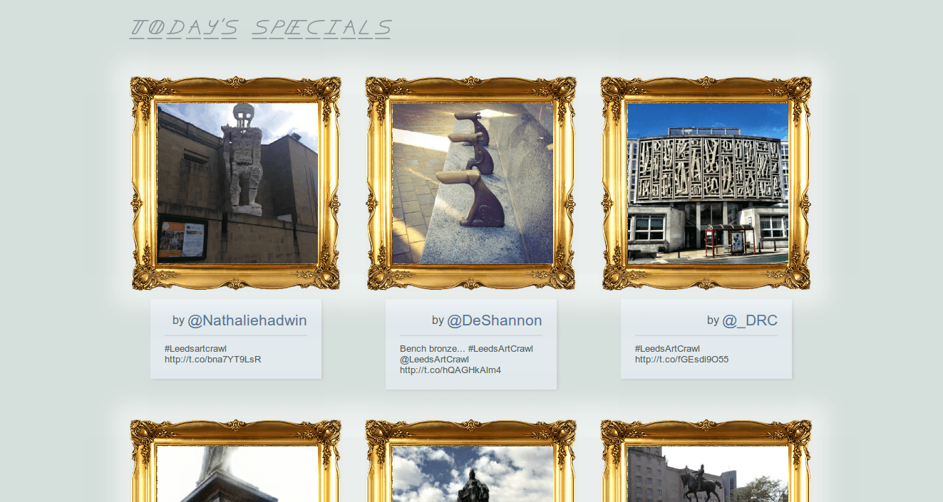
Another "art game" we've made, quite literally, involves an experiment with Open Data, crowdsourcing and public art where our main objective is to create a comprehensive data set about the public art offering across the city. At the same time, we're hoping to craft stories of the public's interaction with the art whilst also mapping routes around them and find out how subjective the subject in question is.
There's a blog post on the site if you're inclined to read more about the game at its current iteration but as with all things game, this will very quickly become obsolete as the game evolves into something else entirely when people start playing them. At least that's what we're hoping when we get more data to play with. And speaking of more data, it would be nice if you joined in.
It's quite easy to "play" - just tweet a photo of a piece of art you find in the city with #leedsartcrawl and make sure location is turned on.
Doing this will post your photo to a public gallery with credits to your twitter account and the location of said photo when it was taken. If you tweet more than one in a day, you'll create a route of all the photos you took which will be displayed on a map. It's currently filtered to Leeds, UK but with such a generic method of data collection, it can be applied to almost anything under the same rules.
Presently, we have plans for a scoring system, leaderboard and achievements, the whole nine yards but we're hoping to streamline it even more so it doesn't feel tacked on. The final project will be open source and hopefully, useful for anyone wanting to test the limits of the "game".
The site is very new so there's plenty to do but you can take a peek - http://artcrawl.leedsdatamill.org/
I'm going to place the links here if you're feeling generous to vote our way. Many thanks in advance :}
In keeping with timing of releases and all that, we also made public Swanky Art, our new pixel art community based on restrictive daily challenges where you can play with the online version of Swanky Paint. We've got fun plans for this project as it is dear to our hearts and hopefully other people feel the same way about it.
You can start pushing pixels, view your galleries and comment on other peoples', along with various other things on the official site - http://paint.lo4d.net.
Another "art game" we've made, quite literally, involves an experiment with Open Data, crowdsourcing and public art where our main objective is to create a comprehensive data set about the public art offering across the city. At the same time, we're hoping to craft stories of the public's interaction with the art whilst also mapping routes around them and find out how subjective the subject in question is.
There's a blog post on the site if you're inclined to read more about the game at its current iteration but as with all things game, this will very quickly become obsolete as the game evolves into something else entirely when people start playing them. At least that's what we're hoping when we get more data to play with. And speaking of more data, it would be nice if you joined in.
It's quite easy to "play" - just tweet a photo of a piece of art you find in the city with #leedsartcrawl and make sure location is turned on.
Doing this will post your photo to a public gallery with credits to your twitter account and the location of said photo when it was taken. If you tweet more than one in a day, you'll create a route of all the photos you took which will be displayed on a map. It's currently filtered to Leeds, UK but with such a generic method of data collection, it can be applied to almost anything under the same rules.
Presently, we have plans for a scoring system, leaderboard and achievements, the whole nine yards but we're hoping to streamline it even more so it doesn't feel tacked on. The final project will be open source and hopefully, useful for anyone wanting to test the limits of the "game".
The site is very new so there's plenty to do but you can take a peek - http://artcrawl.leedsdatamill.org/
Another day, another Humble Bundle. They say 37 percent of Steam games have never been played. I will gladly confess this applies to me too but mostly because I already have a copy of the game on several consoles and couldn't pass up another copy at such "exorbitant" prices.
But enough is enough, I've recently unsubscribed to all of these bundle programs for fear of increasing my dust collection but also because I'm getting at least one email a day about these limited edition deals. Besides, unlike me, the other half is still subscribed and will always inform me of them when they go live.
Anyway, I was looking up a fellow games developer to see if they had released anything recently and came across a blog post several years old about their game being sold in the Humble Bundle. At the time, I was not at all aware of the age of the post so clicked further to investigate.
Strange, I thought, that there were a couple of the games that were mentioned in the blog post (via the Humble Widget) present on the Humble Bundle page but not all of the games and definitely not any of the previous developer I was looking into.
It was at this moment that I realised the date of the post and then it struck me - How frequent do the same games get posted on the Bundle Store? A quick search of a few hours revealed no answer but quite a few data visualisations of mostly monetary resolutions.
"I suppose I could create a simple spreadsheet."
And thanks to this Wikipedia entry, I did. Behold.
There are a few tabs there.
1. Pivot Games - Frequency of games bundled.
2. Pivot Devs - Frequency of Game Developers appearing in bundles.
3. Original - Original file sans the "Descriptions" row.
4. Clean - Only the games and the developers of them.
*Data is populated as of 30 April 2014.
Obviously, you can come up with your own conclusions. Interesting? Yeaaap.

Idea
Hackathons pierce our otherwise intense work schedules with something fun and unpredictable so we always look out for them especially if they are held within our radius of travel.
The National Hack the Government event was unlike other hackathons we’ve previously attended in such a way that it was intended to solve problems; or rather, to ask the right questions for the problems to be understood before they can be solved.
And this was totally different for us, where previously it was mostly about creating the weirdest, overambitious hack you could think of within the time limit.
The event was held in the Leeds City Museum, home to many previous hackathons, and from the moment we stepped in, it was clear something was different. There weren’t as many people as we had expected but there was a calm buzz in the air with clusters of people huddling in groups, deep in conversation. As we sat down, the organizers came over to introduce themselves and thanked us for coming. We’re not familiar with their work since we travel in different circles (industry-wise) but as our recent endeavour involve Open Data, it seemed almost perfect timing that Leeds Data Mill was hosting this event so close to where we are.
There were a few suggestions for what you could do with the data supplied through the website and people sorted themselves into the respective groups to tackle these challenges. Within our group, it was amazing to note the vast multidisciplinary backgrounds of the participants.
We didn't really approach the hack with any ideas for what we were going to build but being game developers, building some sort of game is always on the table. Our group branched out into smaller groups since there was a maximum of 4-5 per group and we ended up on our own.
Browsing through the available datasets, we quickly decided that it would be interesting to try and visualise one of them as a game level so rather than just being told what the data was, you would have a chance to experience it instead. What we’ve learnt from creating and playing games and through feedback from players is that you learn in a totally different way compared to the traditional method. Games engage you to interact and this provokes a different kind of response even if the resulting effect is still the same; repetition to memorise.
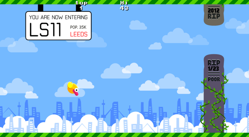
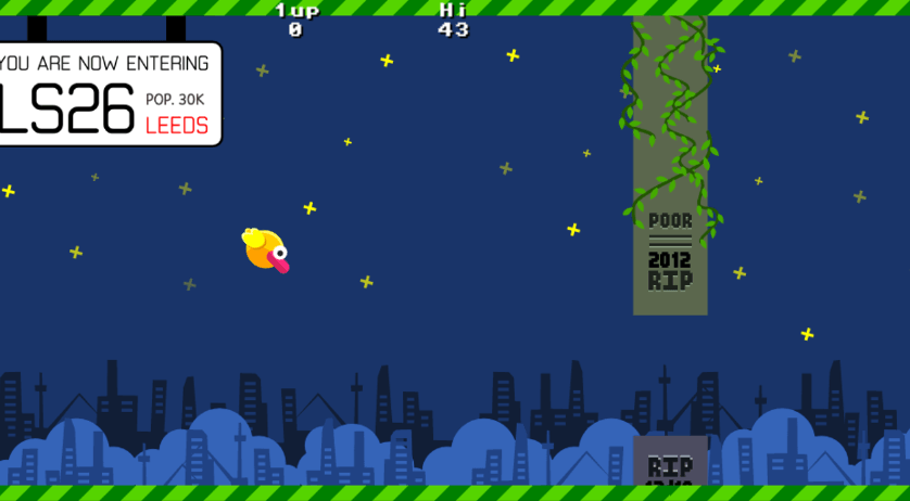
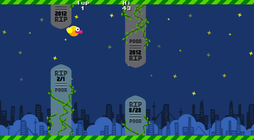
Flappy Bird is a recent media darling and actually a style of game that we felt we could recreate within the time constraints so it ended up being a natural choice. When we looked at the Public Health Funeral Data, it seemed an unlikely thing to be visualised as a game. For that reason, it was clear that it had to be done and after studying the data, we became aware of an issue that was previously unknown to us - Loneliness - so this was something we felt was worth drawing attention to.
Hopefully our intentions are realised!
Mapping The Data
Now comes the interesting bit which might get a little technical but bear with us.
It has to be understood that there is no randomness in the game; all random values are actually derived directly from the data that is mapped into postcode sections. The Leeds postcodes are then displayed prominently prior to entering the section when you play the game.
The idea here is that as you learn the data, you will associate it with each postcode. Putting in a small amount of randomness by randomly deciding which postcode section will come next adds a little unpredictability into the mix so you can memorise each section but not the order they come in as.
Each funeral is sorted by date. We have about two years of data (Jan 2012 - Feb 2014) and in each postcode section, the data is presented to the player in a simple time line.
Each obstacle is a gravestone with a gap in it. We position the gap at the top of the screen for January and at the bottom of the screen for December (when you fly through a gap lower on the screen, the death occurred in December). Since we also sort by date and have two years worth of data, you can tell when one year ends and another year starts because the gap will jump back up to the top.
The size of the gap, and hence how easy it is to fit through, is driven by the cost of the funeral. A bigger gap means a more expensive funeral and a smaller gap means a cheaper funeral. We found that the prices varied quite a lot but mostly stayed within £1300 - £1600.
The distance between obstacles is the day of the month that the funeral took place on, so if you get a long gap it will mean that the last funeral took place at the end of the month.
Data Quality
Even on a rather small number of data points, we still encountered data quality issues. For instance, most dates are of the 2014-12-31 format but one of them had the year at the end rather than the start and one postcode was missing a letter which took us aback when we had to sort them.
We also had no real idea what some of the columns actually meant but since they were mostly empty, we decided to remove them from the visualisation.
One thing we have learnt from working with other datasets is that you really need access to someone who understands the data. Even with good documentation, you will only learn what people are meant to publish and it takes experience to learn what people are actually publishing and what certain patterns really mean.
Data without context is just not as useful and prone to misinterpretation.
Source code
Lonely Bird was created using our own open source Lua based game engine called Gamecake. We are releasing the full code and art assets as an MIT licensed project. You can find it all in the following repository along with other code examples.
https://github.com/xriss/gamecakejam/tree/master/lonelybird
We have also published the Android build on Google's Play Store which you can download for free and play on your Android phone or tablet. (Don’t worry, it contains no ads.)
https://play.google.com/store/apps/details?id=com.wetgenes.lonelybird
You are free to use, remix and rebuild to your hearts content. A simple change would be replacing the CSV file containing the data with another file or even just newer data to create a new set of levels.
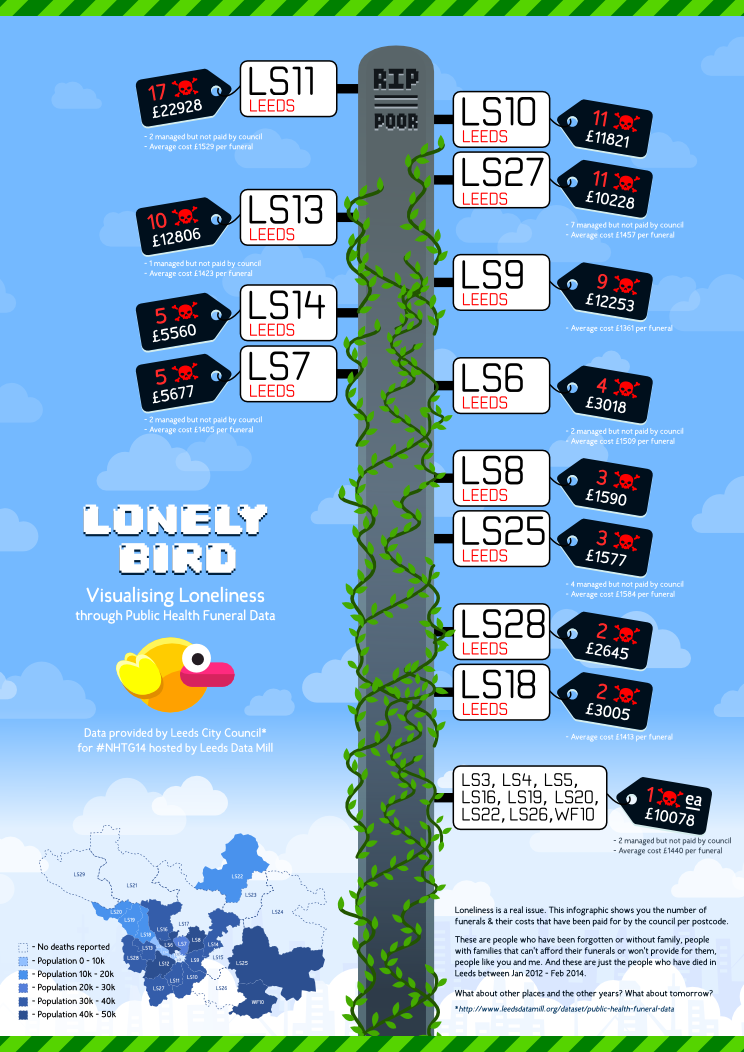
To accompany the game, we’ve also created an infographic in both PDF and PNG formats so you can print those out as posters or use them in any way you like.
https://raw.githubusercontent.com/xriss/gamecakejam/master/lonelybird/art/press/lonelybirdposter.pdf
https://raw.githubusercontent.com/xriss/gamecakejam/master/lonelybird/art/press/lonelybirdposter.png
Final words
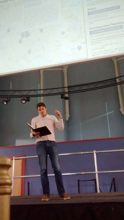
The hackathon, we felt, was a great success. It was obvious that the organizers have put in a tonne of effort to create such a welcoming and engaging environment for the participants, not to mention the wonderful food and freebies galore - we’ve never felt so spoilt at an event!
There was clearly an urgency to solve problems, a shared willingness to help. Many of the participants had never been to a hackathon before so was floored by the possibilities you could achieve by sharing ideas with thinkers, designers and doers in one room.
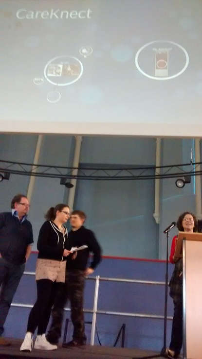
CareKnect asked a simple question - what does it take to be well and stay well? By harnessing the power of other people in your local area, you were able to search what other people like you were doing to be well and where, via similar variables of symptoms or causes. But the most exciting part was the interface - a robot that talks to you on-screen!
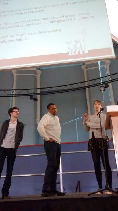
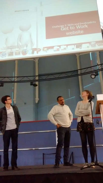
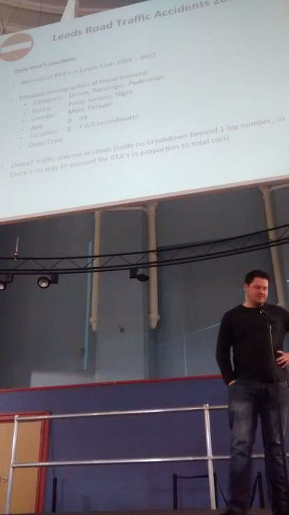
Get to Work tackles the murky waters of employment search. The group used transport data to include the costs of travel from where you live so this got really interesting when you took that into account when displaying and comparing the same job title in different towns. This is when it became obvious that many of the job sites out there are, frankly, rubbish.
City Dashboard will show progress towards meeting six of the priority actions defined in the Leeds Climate Change Strategy (2012-2015). Read more.
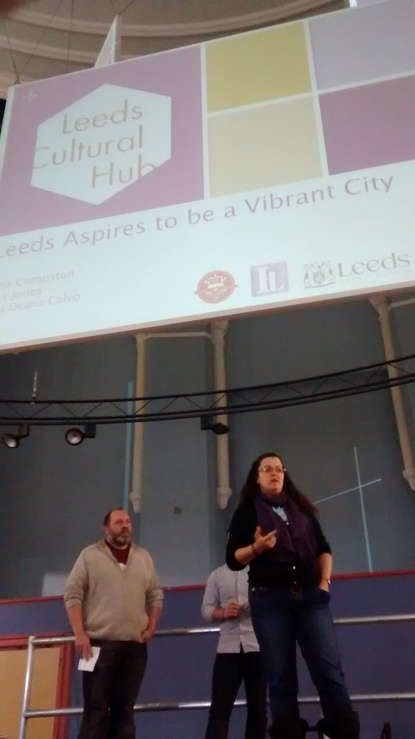
Drive Safe Leeds is a neat little app that calculates the probability of crashing when you're out driving on the road. Leeds Cultural Hub will highlight the cultural offering & levels of participation across the city. Read more.
Finally, Oompah.py is a musical representation of footfall data through the medium of the brass band. Read more.
We’ve had the pleasure of meeting so many wonderful people and are humbled by their ideas and hopes to help others. Thank you for letting us be a part of this! We only wished there was a way to get in touch with the other people we’ve met as we were so engrossed in creating, we forgot to exchange details with everyone.
Before we end, have some Lonely Bird tunes :}
Updates: 5th July 2014
Swanky Paint is now on Greenlight! Do vote if you like what we're doing :}
Also, if you're running the Chrome browser, you can try out Swanky Paint and play along with us at our new pixel art community, Swanky Art. It's new so we're still building the site but that hasn't stopped anyone from creating awesome pixel art there already!
We've been developing Swanky Paint, a Deluxe Paint clone from the Amiga days, for the past month or so mostly in closed beta, gathering feedback from numerous testers and pixel artists via the Pixel Art community on Google+. You can never have too many testers so if you fancy yourself a pixel pusher, get in touch on G+ at https://plus.google.com/+KrissBlank and you'll be added to a super secret circle.
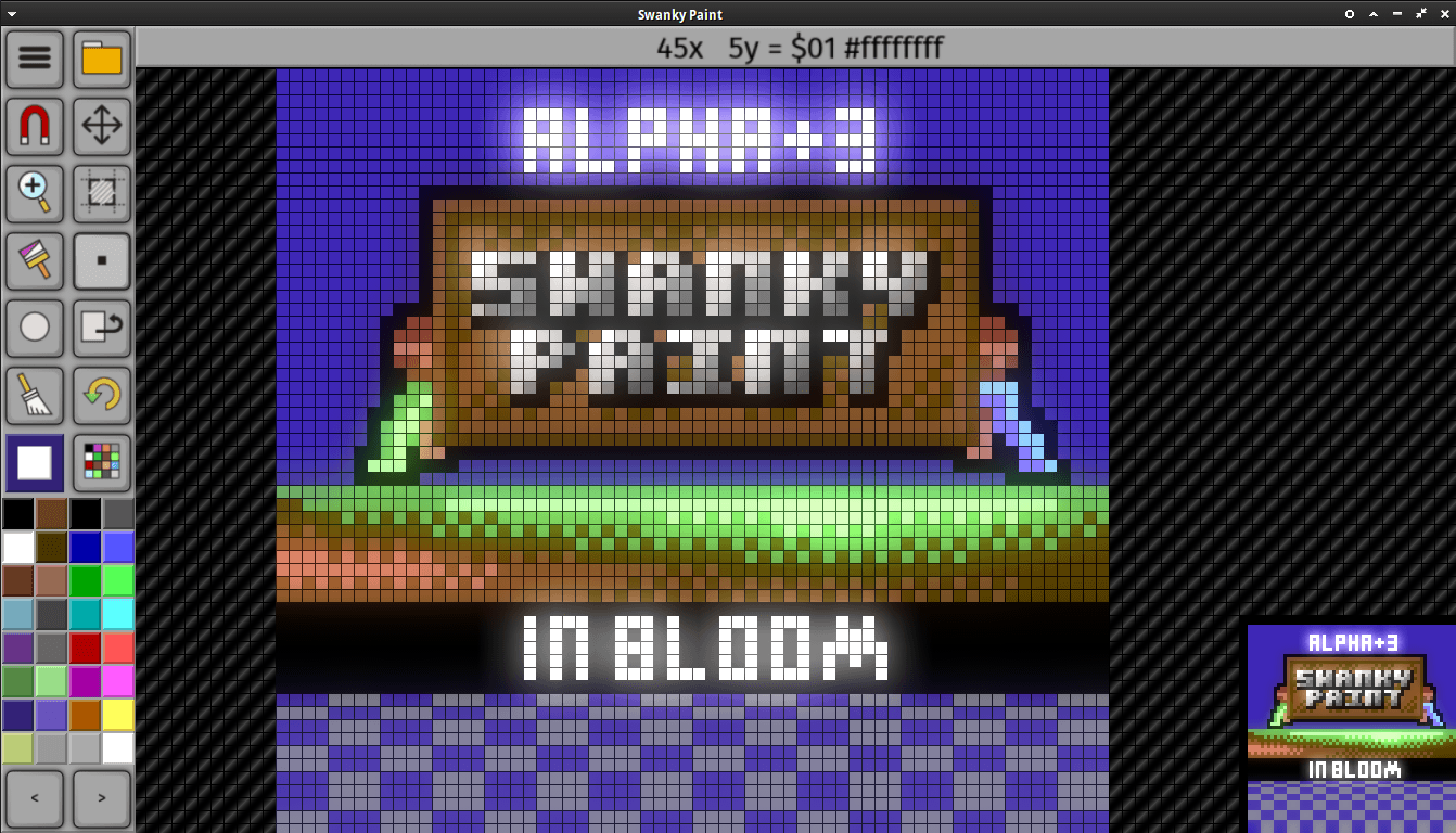
Updates will be constant with a new version being rolled out as I type this. We're pushing out new features weekly and pretty open with development stages and examples. For instance, the latest version would have included animation support. A new feature that currently has the basics down so you can load and save animated gifs at the moment with no limit to the number of frames. The user interface needs tightening but since we're adding stuff as we go along, this will keep changing. It's only been one version earlier that we've only added icons :}
Anyway, I've been busy making the manuals for the pixel editor hopefully in time for GaMaYo #5 and Maker Day by Sheffield Hackers and Makers which are all happening at the end of the week. If you're going to either of those, make sure to say hello so I can give you a special ticket!
Manuals will be in pdf format so you can print them out and pretend you're in the 80s except they won't be quite as thick.
We will be pushing Swanky Paint to a few stores online so you can get the official versions from them when that happens and also on our own distribution site, Dimeload where you can already access the closed beta versions.
Swanky Paint is available for Linux, Windows, Raspberry Pi, OSX and Android (tablets/mobile).
Happy Pixels!
The latest installment of The Drive-In HorrorShow webcomic is now up along with a Halloweenween-inspired blog post by me :}
http://horrordriv.esyou.com/blog/3
I am really hoping to push other creatives doing their own thing under the horror theme so if you're out there, boo!
Otherwise, if you're a creative doing awesome things that I don't know about, get in touch!
http://horrordriv.esyou.com/blog/3
I am really hoping to push other creatives doing their own thing under the horror theme so if you're out there, boo!
Otherwise, if you're a creative doing awesome things that I don't know about, get in touch!